Did you know that approximately 1 in 12 men and 1 in 200 women worldwide are affected by color blindness? That’s a significant portion of the population that website designers often overlook. Creating a website design that’s accessible to color blind users is not only important for inclusivity but also for creating a seamless user experience. In this blog post, we’ll delve into the importance of website design for color blind users and provide tips for designing website pages for color blindness.
Why Web Page Design for Color Blind Users is Important:
Creating a website design for color blind users is essential for providing an equal and accessible user experience. Color blindness is not just one condition but a spectrum of different types of color vision deficiencies. For some color blind users, distinguishing between red and green or blue and yellow can be a challenge, making it difficult to navigate a website’s color-coded elements. Websites that fail to consider the needs of color blind users risk alienating a significant portion of their audience and missing out on potential conversions.

- Here are some facts that you have to consider:
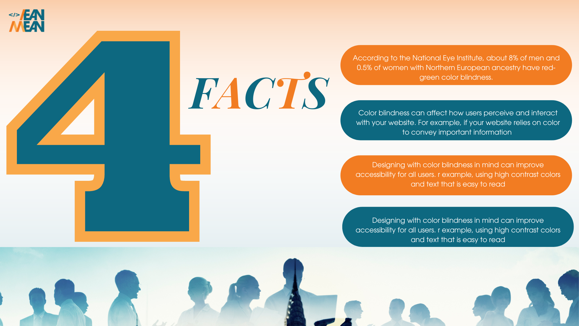
Color blindness is more common than you might think. According to the National Eye Institute, about 8% of men and 0.5% of women with Northern European ancestry have red-green color blindness. - Color blindness can affect how users perceive and interact with your website. For example, if your website relies on color to convey important information (such as green for “good” and red for “bad”), color blind users may not be able to understand the message.
- Creating a website design with color blindness in mind can improve accessibility for all users. For example, using high contrast colors and text that is easy to read can benefit users with other visual impairments as well as those without.
- By designing for color blindness, you can make your website design more inclusive and show that you value and prioritize the needs of all your users.
Designing Web Pages for Color Blindness Tips:

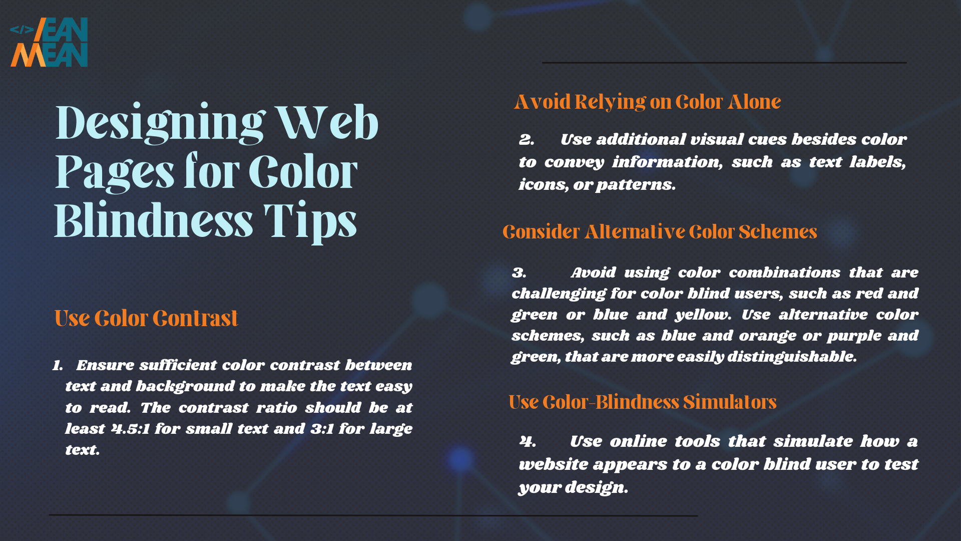
1. Use Color Contrast
Ensure sufficient color contrast between text and background to make the text easy to read in your website design. The contrast ratio should be at least 4.5:1 for small text and 3:1 for large text.
2. Avoid Relying on Color Alone
Use additional visual cues besides color in your website design to convey information, such as text labels, icons, or patterns.
3. Consider Alternative Color Schemes
Avoid using color combinations that are challenging for color blind users, such as red and green or blue and yellow. Use alternative color schemes, such as blue and orange or purple and green, that are more easily distinguishable.
4. Use Color – Blindess Simulators
Use online tools that simulate how a website design appears to a color blind user to test your design.
Don’t let color blindness prevent your website from reaching its full potential. At Lean Mean, we understand the importance of creating an inclusive and accessible website design for all users. Contact us today to learn how we can help you design a website that’s optimized for color blind users and provides a seamless user experience for all.
Hashtags: #ColorBlindnessAwareness #WebDesign #Accessibility #InclusiveDesign #LeanMeanWebDevelopment
Copyright 2023 LEAN MEAN. All Rights Reserved.
Located in Northern Michigan
